


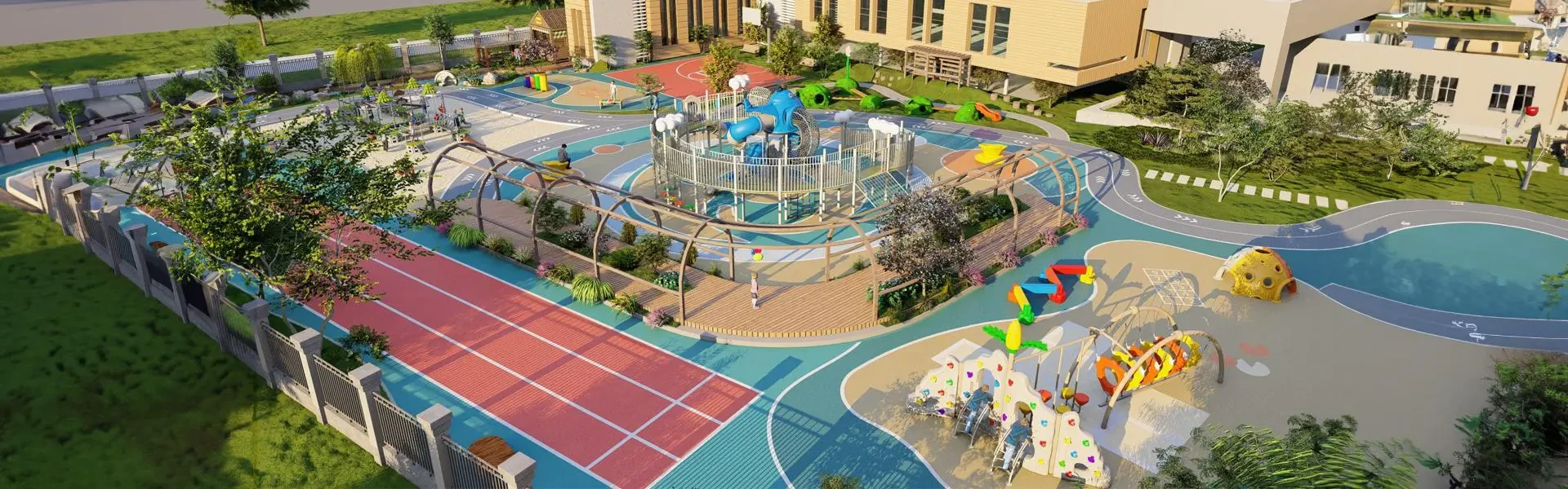
In the bustling, often hectic life of modern times, finding a sanctuary for children to play and explore is crucial. A growing trend in indoor playground design is the incorporation of pastel colors, creating a serene and inviting environment that both parents and children adore. Pastel color indoor playground equipment not only enhances the aesthetic appeal but also offers numerous benefits for child development and well-being.
The Appeal of Pastel Colors
Pastel colors are softer and more subtle compared to their vibrant counterparts. These hues, which include gentle pinks, blues, yellows, and greens, exude a sense of calm and tranquility. This soothing effect can make a significant difference in an indoor play area where young children spend a lot of time.
The psychological impact of colors on children is well-documented. Bright and overly saturated colors can be stimulating to the point of overwhelming, especially for sensitive children or those with sensory processing issues. Pastel hues, on the other hand, provide a more balanced sensory experience, reducing stress and promoting relaxation.
Benefits for Child Development
Emotional Well-Being: Pastel colors can help in creating a peaceful atmosphere that aids in emotional regulation. For preschoolers and young children, who are at a critical stage of emotional and social development, this calming environment can foster better focus and interaction.
Cognitive Development: A less chaotic color scheme allows children to concentrate better on activities and tasks at hand. This can be particularly beneficial in educational play areas where learning through play is a key objective.
Physical Activity: Soft, pastel-colored equipment can encourage more physical activity by making the space appear less daunting and more accessible. Climbing walls, slides, and tunnels in pastel shades invite exploration and imaginative play, essential for physical growth and motor skills development.
Aesthetic Education: Introducing children to different colors in a non-aggressive way can also be an early lesson in color recognition and appreciation of beauty. This subconscious learning can be very beneficial in their overall education.
Design Elements to Consider
When designing an indoor playground with pastel color schemes, it’s important to strike a balance between different elements. Here are some tips to keep in mind:
Color Coordination: Use a harmonious blend of pastel hues to avoid monotony and create a visually appealing space. For example, pairing soft lavender with a pale peach can create a beautiful yet subtle gradient effect.
Material Selection: Combine pastel-colored soft materials like foam mats and plush toys with natural wood accents to maintain a warm and inviting atmosphere.
Lighting: Soft, diffused lighting can complement pastel colors, enhancing the overall tranquil ambiance of the play area.
Safety First: While pastel colors can soften the look of the playground, safety should never be compromised. Ensure all equipment meets safety standards and is free from sharp edges or harmful materials.
Conclusion
Incorporating pastel color indoor playground equipment is a thoughtful approach to creating a nurturing environment for children. Beyond just looking pretty, these colors contribute positively to the children’s emotional and cognitive development. As more families and educators recognize these benefits, the trend of using pastel colors in indoor play spaces is likely to continue growing, making our children’s playtime experiences even more delightful and enriching.